Search Knowledge Base by Keyword
-
Introduction
-
Fundamentals
-
Favorites
-
Dashboards
-
Attachments
-
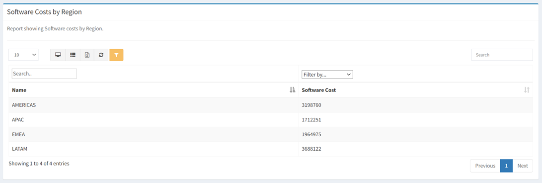
Reports
-
- Available Reports
- All Asset Types
- Application Certification Status
- Application Discovery
- Application Group Analysis
- App Group to SCCM Collection Analysis
- Application Install Count
- Application License Management
- Application Usage
- Asset Count by Property
- Asset Links Count by Asset Type
- Build Sheet
- Computer User Assignment
- Migration Readiness (Basic)
- Migration Readiness (Complex)
- O365 License Management
- O365 Migration Readiness
- SCCM OSD Status
- Scheduled Computers by Wave
- Scheduled Users by Manager
- User Migration Readiness
- VIP Users
- Wave & Task Details
- Wave Group
- Windows 10 Applications
- Patch Summary
- Delegate Relationships
- Show all articles ( 12 ) Collapse Articles
-
Self Service
-
Workflow
-
Assets
-
- View Asset
- Asset Properties
- Images
- Notes
- Waves
- Tasks
- Attachments
- History
- Rationalization
- QR Code
- Linked Assets
- SCCM Add/Remove Programs
- Altiris Add/Remove Programs
- Related Assets
- Relationship Chart
- Permissions
- Show all articles ( 1 ) Collapse Articles
-
Event Logs
-
Users & Groups
-
Asset Types
-
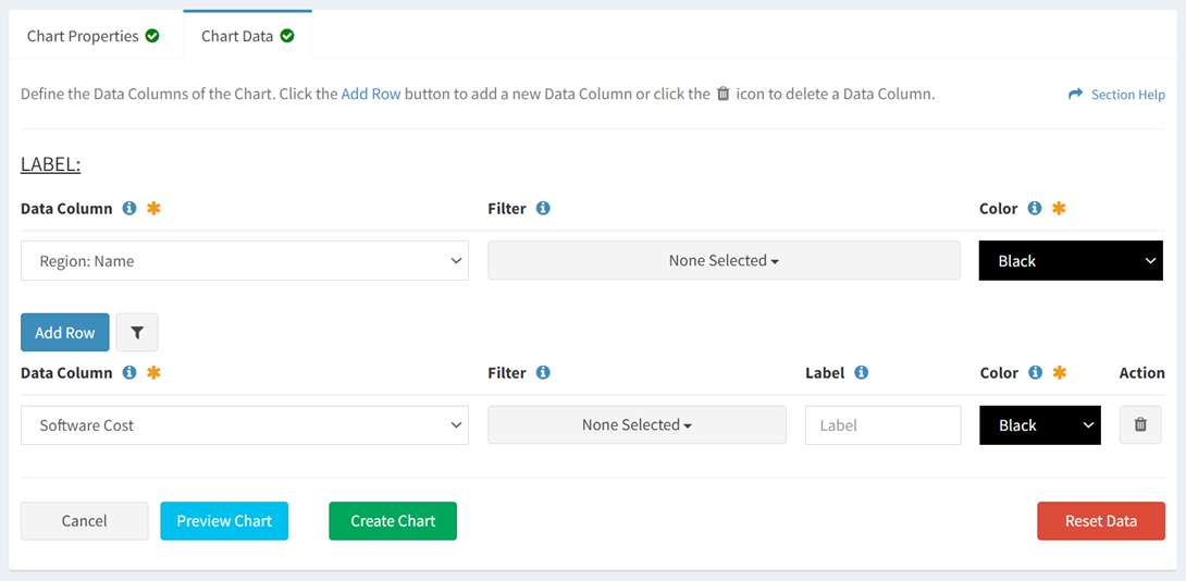
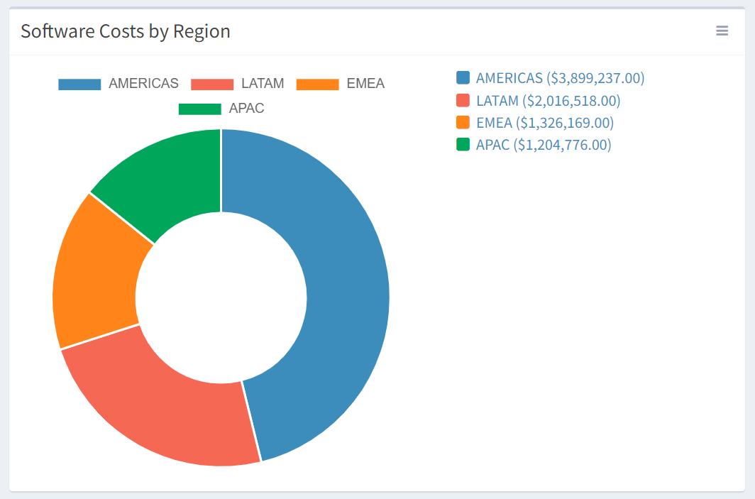
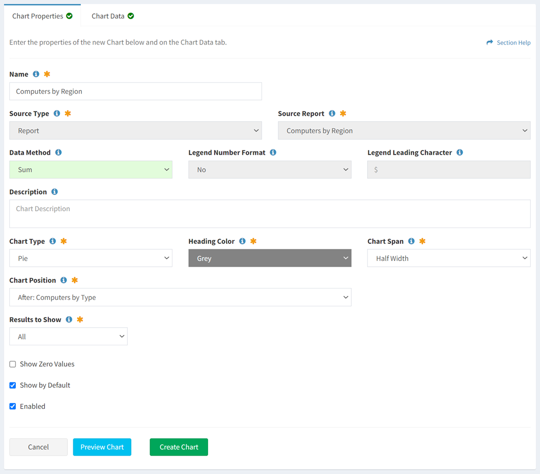
Charts & Dashboards
-
Options
-
Module Settings
-
API & Stored Procedures
-
Administration
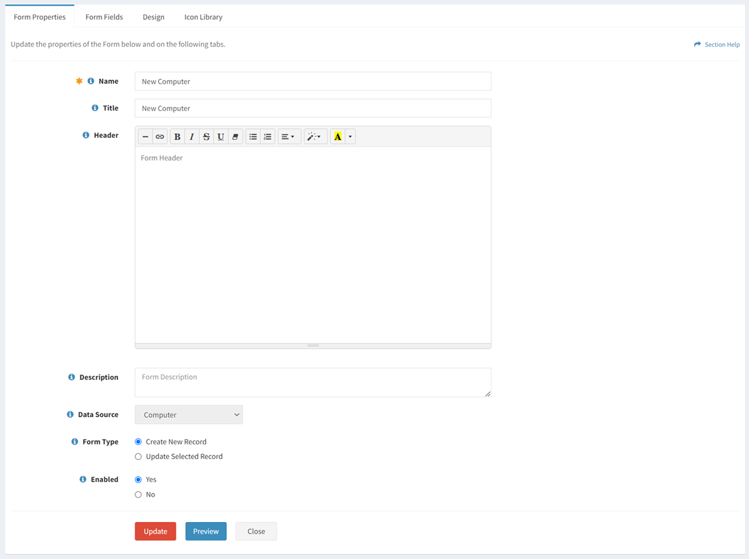
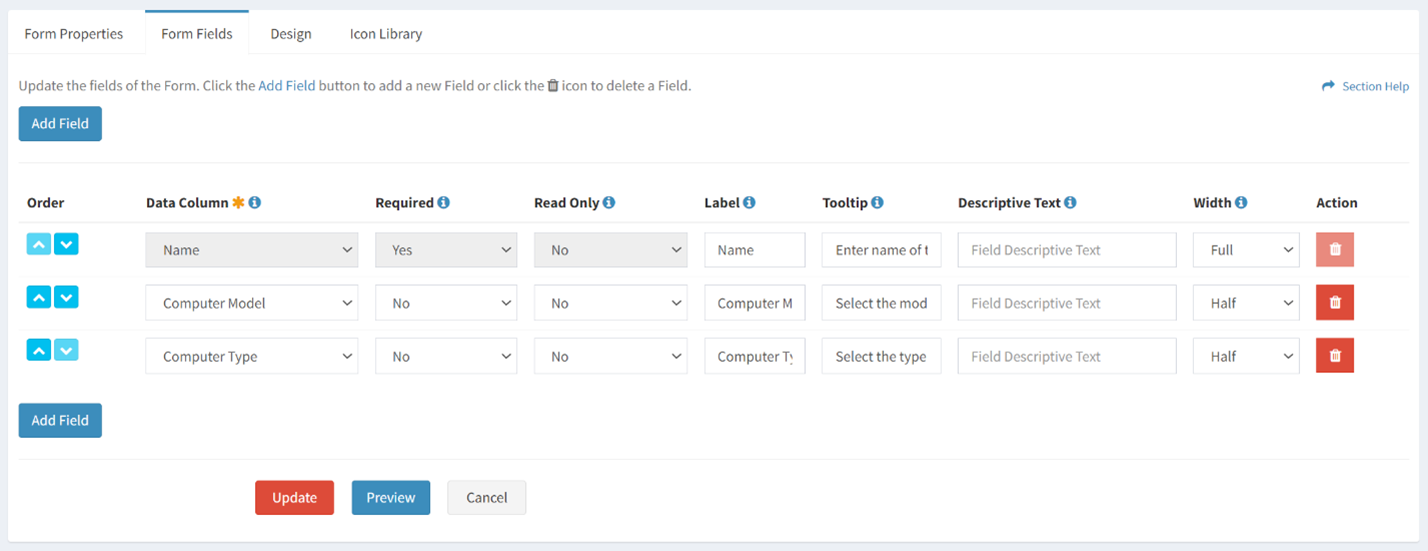
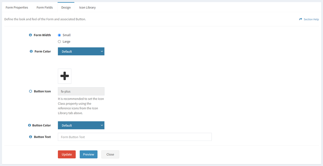
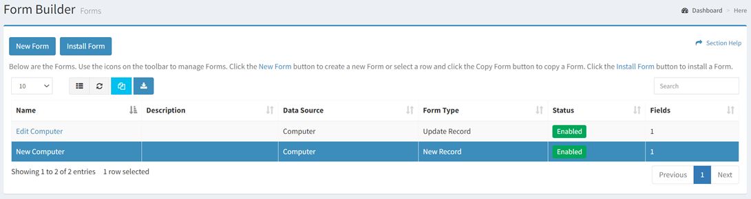
Report Widgets
< Back
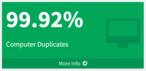
From the Analytics dashboard page, you can drilldown into your analytics report to see additional details. To drilldown:
- Click the More info hyperlink on the report widget to drilldown into the analytics report. You will be redirected to the
- Anomalous Data, Duplicate Data or Missing Data report.
